The Psychology Behind Colorful Charts: How Visuals Enhance Understanding
The use of colorful charts in data presentation taps into the psychology of color, which has a profound impact on human perception and understanding. Colors can evoke emotions, influence decision-making, and facilitate memory retention. For example, using a vibrant red can draw attention to critical data points, while calm blues may help in soothing anxiety when dealing with complex information. By strategically employing color palettes, individuals can enhance the clarity of their visuals, making it easier for viewers to grasp intricate data and derive meaningful insights.
Moreover, visuals like charts not only convey information quickly but also improve engagement. Studies have shown that visual learners retain up to 65% more information when it is presented visually as opposed to textually. By incorporating colorful infographics and diagrams, data can be transformed into a narrative that resonates with diverse audiences. Ultimately, the psychology behind colorful charts reveals how effectively combining visual elements with color can significantly amplify understanding and retention of complex data.
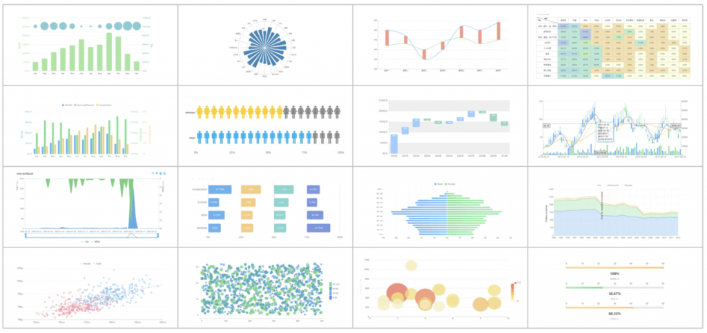
10 Chart Types That Bring Your Data to Life
Visualizing data effectively is crucial, and selecting the right chart type can significantly enhance the way your audience interprets information. Here are 10 chart types that bring your data to life:
- Bar Chart: Ideal for comparing quantities, bar charts provide a clear visual contrast between different categories.
- Line Chart: Perfect for displaying trends over time, line charts connect data points with a continuous line, making it easy to spot patterns.
- Pie Chart: Great for showing proportions, pie charts visually represent parts of a whole, though they are best used with limited categories.
- Scatter Plot: Excellent for illustrating relationships between two variables, scatter plots plot data points on a two-dimensional graph.
- Histogram: Useful for displaying the distribution of data, histograms group data into ranges and show frequency.
- Area Chart: A variation of line charts, area charts fill the space below the line, emphasizing the magnitude of change over time.
- Heat Map: Effective for visualizing complex data, heat maps use color gradients to represent the frequency or intensity of events.
- Bubble Chart: Combining elements of scatter plots and size representation, bubble charts allow for three dimensions of data to be visualized.
- Radar Chart: Also known as spider charts, these are great for comparing multiple variables, making them useful for performance assessments.
- Box Plot: Ideal for showcasing data distributions, box plots summarize data through their quartiles and highlight outliers.
Choosing the right chart type can transform raw data into compelling stories. When used appropriately, these 10 chart types not only make data more digestible but also enhance user engagement. By effectively illustrating key trends and patterns, you can help your audience derive meaningful insights and make informed decisions based on the data presented.
How to Create Charts That Spark Joy: Tips for Engaging Visualizations
Creating charts that spark joy involves more than just presenting data; it’s about crafting a visual experience that captivates your audience. Start by selecting the right type of chart for your data. For instance, use a bar chart to compare quantities or a line graph to show trends over time. Additionally, ensure your visualizations incorporate a cohesive color palette that aligns with your brand or message. This not only enhances aesthetics but also aids in the interpretation of data.
Furthermore, always prioritize simplicity and clarity when designing your charts. Avoid cluttering your visuals with excessive information, which can overwhelm viewers. Instead, focus on the key insights you want to communicate. Using annotations to highlight important data points can help guide your audience’s attention. Remember, a well-structured chart should tell a story, allowing the audience to effortlessly grasp the main takeaway without confusion.